A too-much-data story.
Short summary:
The Purugganan lab at NYU has studied rice genomics for years and had accumulated terabytes of data that was used very little due to accessibility. For my MS, I built a tool to allow researchers to quickly scan that data to answer questions, to reduce redundant use of research funds, to inform new hypotheses, and to inspire future research.
The Problem
For my MS thesis at NYU, I aimed to address the present problem of sheer amount of data in now available to biologists. The Purugganan lab is known for its research in the population genetics of rice at a global scale, and over the past half decade multiple researchers had collected many terabytes worth of data. A problem in the genomics is how to search through this, and how to present data at such a massive scale. Addressing this problem requires an understanding of systems and database management, programming, and information presentation and design.
The problem the Purugganan lab faced was that they simply had too much data. They wanted to search through their collected data and find quick answers to specific questions using data they already had. But the infrastructure to do this wasn’t there.
My solution
In my attempt to manage this (good-to-have) problem, I created the Oryza Data Center (Oryza sativa is the scientific name for rice), which provided behind the scenes organization in the form of a relational database, a searchable client-facing interface, and interactive visualization for the search results.
What this wasn’t
I was not aiming to recreate genome browsers or other forms of conveying genomic data. There are well established and very good resources for displaying the location of rice genes, gene annotation, protein and gene alignment, population information, etc. I was not aiming to re-create any of these resources, but I did use key information from them to inform my search results.
Tools used
- Python
- SQL
- JavaScript
- Flask
- Bootstrap (HTML, CSS, jQuery)
- Cytoscape.js
What I learned
Practical skills:
I taught myself all the coding and programming required for this project - this required learning write JavaScript and understand and write HTML and CSS. While the results are fairly spartan in their visual representation and rudimentary in their ability (this is probably not a ship-able product here), I’m proud of what I accomplished over a short period of time and without it being my background or training.
To complete this project, I took extra computer science courses at NYU, and sought help from experts outside biology. I also sought out information design courses, and took a two-day workshop given Edward Tufte. Opening up this world alone made this project worth is, as it turns out that I really enjoy thinking and working on this.
This problem is hard:
Biologically, this was an exciting project to get a look at the depth, scope, and limitations of the type of data in the genomics era. There was whole set of recent experiments and publications that the lab produced that I did not manage to include in my thesis work. I didn’t think that I would “solve” the problem of too much data, but I do hope that I made one lab’s past science more accessible to future members of that lab.
About myself:
During this process I found that I really enjoyed working with the visualization component and learning to code D3.js and use Cytoscape. I also enjoyed working to present the search results in such a way that conveyed as much information as clearly as possible. I also learned that I think it’s really cool and interesting to combine data from different sources to see new patterns.
Data Used
- Gene expression and genetic interaction data from Willkins et al.
- genomic data from 77 different rice cultivars (unpublished data from Purugganan lab)
- protein function prediction data (unpublished data from Purugganan lab)
Images
Unfortunately, this tool is not yet public. Below are screenshots from my thesis.
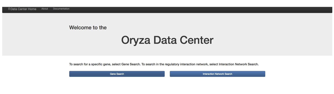
The home page:
If you just wanted to know about a gene, the results page provided basic information (scrapped on the fly from other rice gene sources such as the MSU rice annotation resource) about the gene you were interested in.
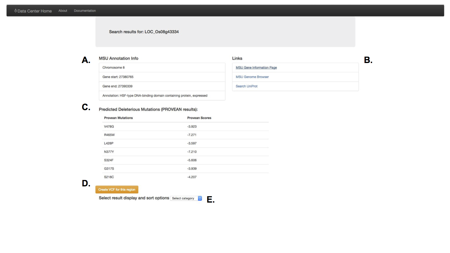
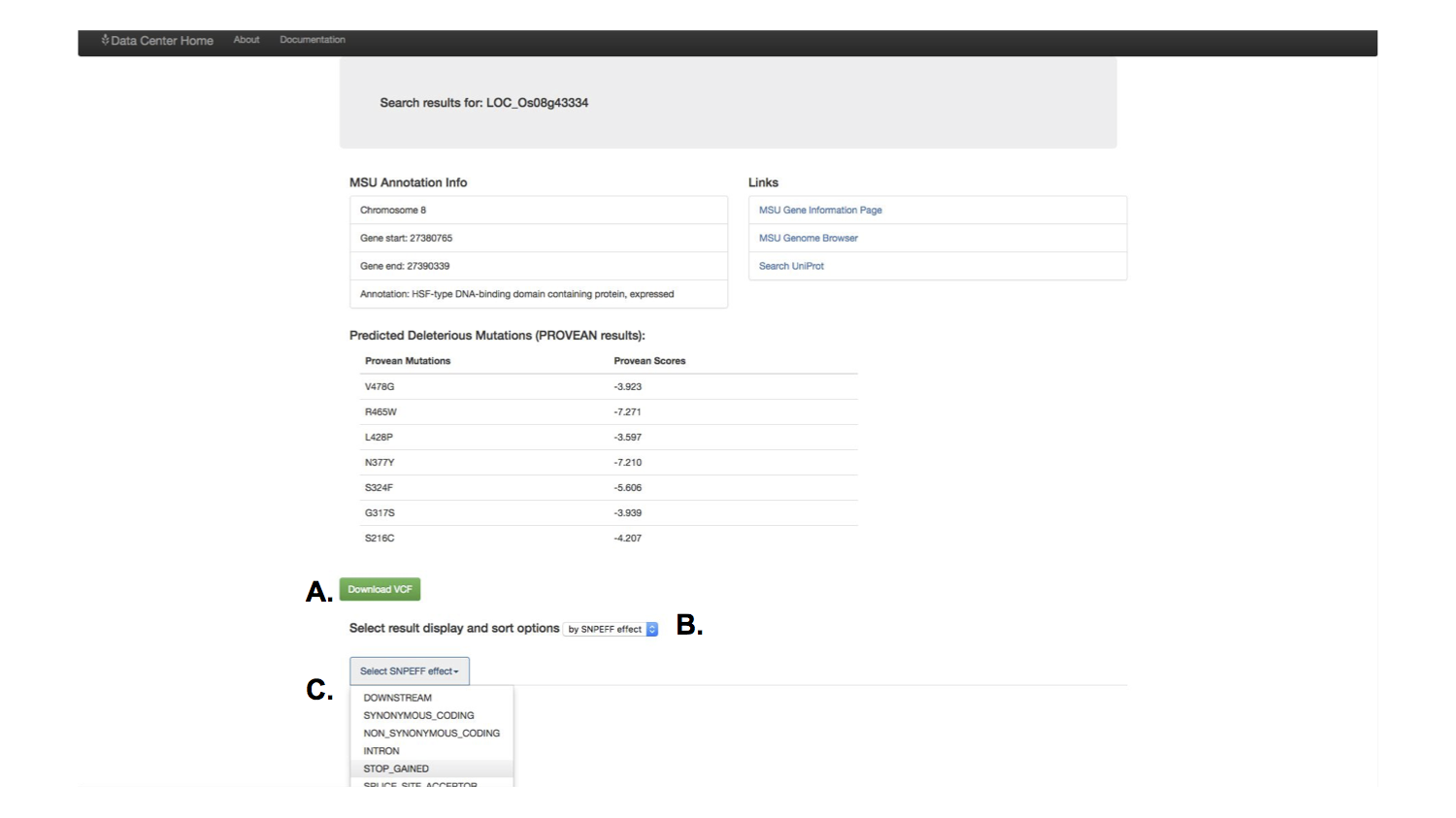
A feature that had been requested by multiple people in the lab were tools to identify genetic variants for specific cultivars of rice. I built a feature that would allow the user to download his or her search results in a variant called format, a specific and widely used format for biological software.
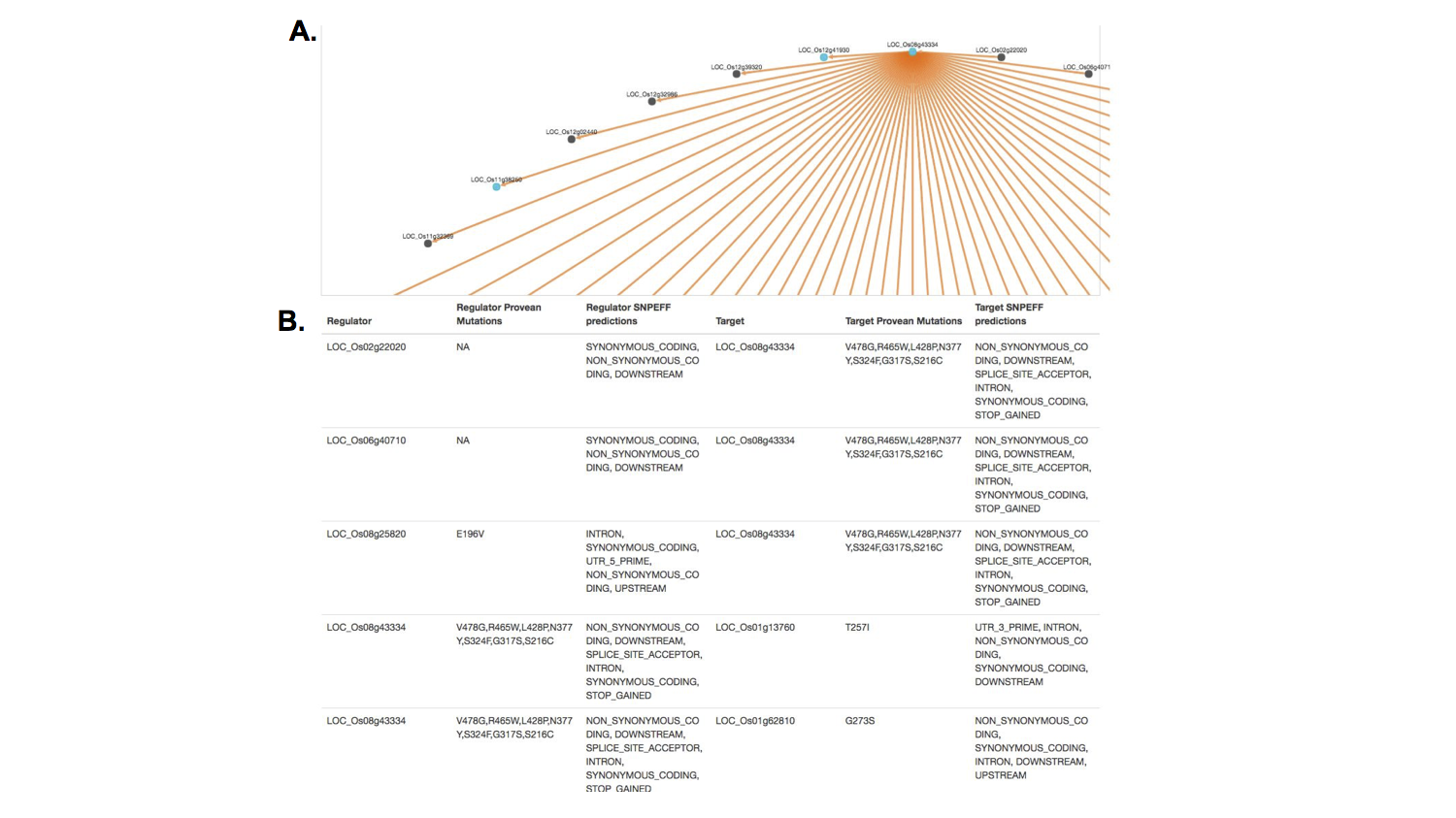
I also included a feature to let the user simply scan the results for important information. These results accessed the information generated by a post doctoral researcher, to predict the effect of genetic variants. You could select which predicted genetic effect to scan through.
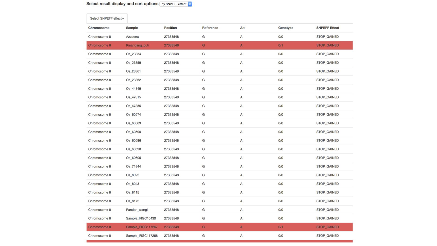
I used color as a layer of information to help the researcher identify important genetic information. Here, a researcher can scan to see which cultivar of rice is positive for a potentially damaging mutation in a specific gene. Red indicates that a cultivar of rice has at least one version of the mutation predicted to have that effect (here, the effect, stop gained indicates that a positive result has a mutation that results an premature stop signal in the gene, a potentially very damaging mutation).
The other feature was representing the gene regulatory interaction network, accessing research done by two other postdoctoral researchers.
This search was a little more complicated. I made an admittedly awkward interface for a user to either auto-generate a SQL query, or would allow them to type in their own. The SQL query format provided the researcher maximum flexibility for what type of interaction and which interaction direction he or she wanted in their results.
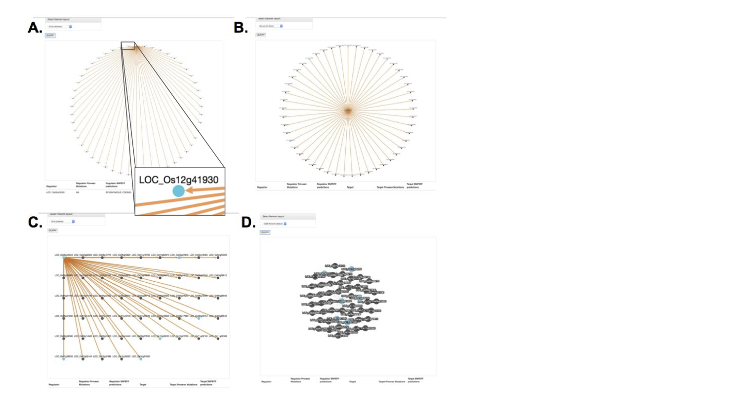
I used Cytoscape.js to display the interactions, where genes are the nodes and their predicted interactions are the edges.
Once a query was made, there were several display options to selection from:
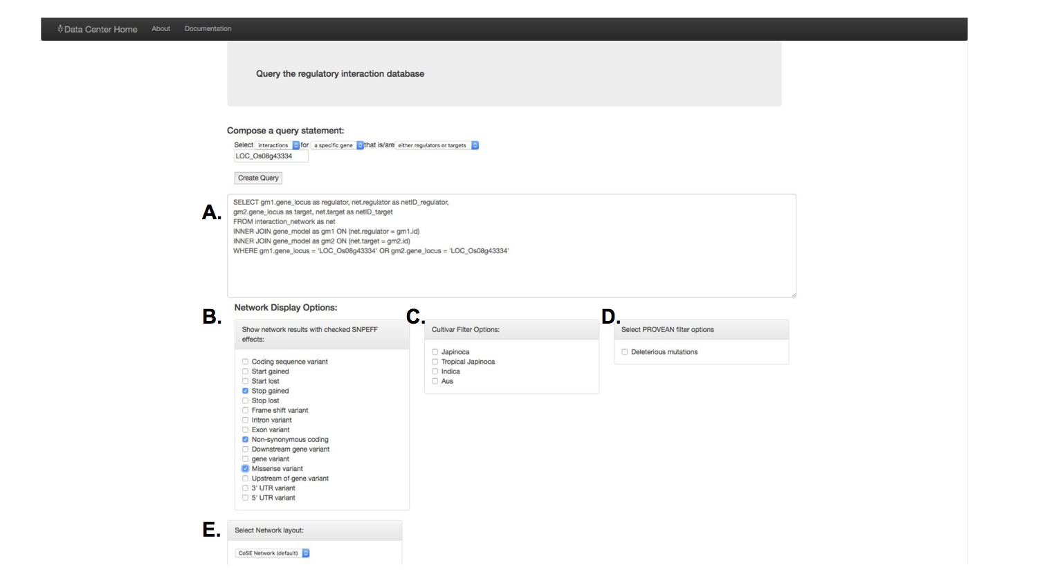
There were different filtering and network layout options, as one is not always the best depending on the search results. The blue coloring once again provided quick information about which genes in this network had certain mutations of interest.
Feature Improvements
Data inclusion. There are many other fantastic research projects done in the Purugganan lab that were not included in this first version of this tool. There is more depth of data available, and future versions should incorporate this research.
Visual representation. I wanted to add more dimensions to the data visualization, and increase the filtering options.
Updating for future formats. Biological formats change quickly in the bioinformatics field. This tool does not automatically update to keep up with the formatting options.
Expand protein function prediction results. Not all of the results for the protein function prediction were included, and it would be useful to know more about how the mutations changed the amino acid sequence of the protein.
Network statistics. Understand gene interaction networks can be challenging, and a having a feature that included summary statistics for each network result would be very helpful for understanding the network.
Expanding from the local network. It’s one thing to know the genes one step stew away from your gene of interest, but what about the genes two or three steps away? How many interaction steps between two genes of interest? Future network features should include expandable network options but taking advantage of the metadata available for the network.
Conclusion
This was an awesome learning opportunity. I learned a lot about rice genomes and rice cultivars, about the different types of data in the genomics era, about database design, about website development. I taught myself three new programming languages well enough to build something that worked. I learned about information presentation, which started me down the path of thinking hard about data visualization in biology and beyond. I also learned a lot about how to relate and combine different types of information in different formats.